
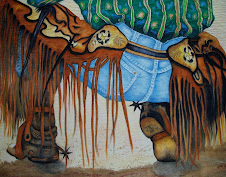
Time to get going on this piece.... Here's Jake... This is a Fundraiser piece for a local food pantry in need of any financial help it can get. I've said before, one of the reasons I enjoy pastel on paper work is that it is quite similar to ink on fabric. There are a obvious differences of course, but the similarities are profound. One uses a slow buildup of color/value...laying color into or over color and blending. A main difference shows up at the beginning stages of pastel. Pastels come out onto paper more like a soft crayon.... but are quite linear to start. Jake looks a bit 'scratchy' to begin with

Then you start to blend using tools, the most efficient at this stage is your fingers. Smudge is a descriptive word.

Much like ink on fabric... the initial goal is the get the main image positioned, blocked in over the whole page. This is somewhat the case here. After this, the real work begins.. adding deeper shadows. refining details. We'll see that next post.


No comments:
Post a Comment